8.30.2008

Wild West


So I decided to go with the theme and do a wild west piece. Started on it on Sunday I think. Worked on it all week while the school work load is light. This is the first digital painting I've ever actually drawn perspective guides for - and I didn't do it until about half way through, so I'm positive there are still a few little issues. But hopefully they're not too obvious.

8.29.2008

Gun Slinger


This evening I had some down time so I decided to waste it do the current "Oondu Theme". It's just a speed paint, nothing finished or anything. But it was fun to do the whole desert scene.

Digital Paint 2

Alright guys I really love the feed back from my last one. There was a lot of figuring out with the last one, but I feel like this one has been a good improvement. I really tried to take everything into account that was mentioned about the last paint. So let me know what you think. ANY suggestions will be welcomed with open arms. I feel like I'm starting to get this but there is still a lot to figure out. Be honest guys.

8.27.2008

Eastern Bloc

Hey guys I'm new
to this  so i figured
i would just go for it
and put some art up,
this is a landscape i 
did on photoshop,
i haven't really showed
this yet, sooo give me
so comments or 
critiques.

Thanks,
Patrick


8.24.2008

Speedy Paint!


Ok guys... it's a bit boring, but let me know what you guys think. All suggestions are welcome. I don't normally do this kinda stuff, but one of my goals this year is to improve my Concept art abilities. After witnessing the "skills" of other members of Oondu, and not having anything to say because they were pretty damn good speed paints, I feel that I need improvement.

So anywho, this took me about 40-50 min...after starting over once, and I did have a ref. shot of a marsh that I was pulling from here and there. I am aware that I need more brushes and for the record i have no idea of a background story, just practicing for now.

8.21.2008

The quest for color.


Still moving along on my color quest. I'm far less afraid to do these things without reference it seems, and they are way more fun. Still mostly just experimenting some more. Felt like doing a ship, and this isn't what i had planned but the minute i sat down I started to throw out some more abstract shapes and got this on. Wish it was more interesting, but I painted myself into a corner with the composition. Every time I added something it just got too crowded.  Next one will be a person for sure. Hopefully a cowboy. Just watched firefly and serenity for the first time recently... and I have to draw something like that. HAVE TO.


Little baby steps. I have no idea what I'm doing. Mostly experimenting. I want to do an interior or something, but my tablet is pretty much broken at this point and drawing the tiniest of straight lines takes far too many retries. Have two wild west things coming along/not... may post a WIP for some help and fake praise so I can push on. I did this to have some fun and save some sanity.

Edit: had to add the border because my colors weren't looking good against white. At this point I look like a complete jake murray wannabe, but it had to be done.

8.19.2008

Well!


Not one to be left in the dark, here's my contribution! It's oil on canvas, and I call her Marina Ezmeralda Cortez. Truth be told, it started out as a portrait of Mila Jovovich--which was awful--and turned into this, which I don't mind nearly as much! Haha, I'll dare say I even like it a bit. So! That said, give me some crits, I know the eyes are a bit off; struggled with that a bit, and I feel like there's more I could do to make her more...structurally sound, so anything would help!

Thank y'much

8.18.2008

Speedie + 1!

UPDATED! 8-21-08
I'm much happier with this now. Still didn't get reference like I probably should have, but compositionally, I think I fixed it as much as I'm going to. Working the trees out gave me an opportunity to experiment with some painter brush variables too, so that was a fun learning experience. Critique AWAY!

Instead of re-posting every other day, I figured I'd just keep adding my speed paintings to this post. I love doing moody environments with dusks and dawns and sunsets, yada yada yada. So for this one I decided to try out just some plain old naturalistic noon lighting seeing as I don't think I've ever really tried it. Not sure how happy I am with it. As always feel free to critique away. Anyway, I call it "Wyrmfang Fortress". About 2 and a half hours, no ref, Painter X.

I need to start doing some urban environments.....


Went home to Indiana this weekend and made a mental note of the colors at dusk. Just felt like doing a quick tribute to the type of scenery I see on the way home. About an hour in Painter X. I love Painter - when it works. :P

8.17.2008

More Progress

Ok guys, got some more progress done on this one. Its pretty polished at this point, but I figured I'd get your opinion before I continued. I hope you guys like it, let me know what you think.

8.14.2008

A little speed paint for your butt

Hey guys, I got bored tonight so I decided to attack some canvass. I give you my hour long speed paint. Listening to Rob Zombie get my creative juices from the dark side flowing. I just had to do it. It was really just for fun so tear it to shreds. SKULLS FOR THE SKULL THRONE...sorry.

8.13.2008

Hahah

Whoa. So I haven't been out here like all summer long. Good to see everyone keeping busy though. I guess for my first post I'll throw out this Heath Ledger Joker I did about half a week ago. Done in Painter X about 3 hours. Hope y'all like it.

8.12.2008

Progress

Hey guys, I just wanted to post the progress ive made on this piece, kinda of a color rough, I'm kinda gettin artists block and could use some words of encouragement, let me know what you all think.

8.10.2008

If I could direct your attention to the right...

We have a new feature off to the side. 

Themes.

Some are probably going "OH NO". But this isn't your normal activity. There is no time limit, it's a suggestion. No one is required to participate, and if one goes unanswered that's ok. Although, since at the moment the suggestions rely on whatever is wagging my tail at the given moment, chances are I'll at least get something out. I'll be trying to keep them nice and broad in subject matter as they come, so there can be many interpretations. None of those "Wizards with blue hats casting spells" crap to be found here. Just cliche' or abstract suggestions that sound fun for any illustrator. Plus, it doesn't hurt to branch out from time to time and beef up your art chops. When will this be over? Probably when I just feel it has had it's fill or won't be taken up on. It takes like a minute to get a new pic over there in that template, so it really doesn't bother me, but don't be surprised if something is up for a month or so. What I'm saying is there is no timetable for these things. At least a week though. Once school starts, I know I won't be keeping a close eye on this place as much as I have so far this summer.

This time we shall jump up on our horses, throw on our hats and shoot massive holes in thin objects while we laugh drunkenly into the desert sun. Large run-ons aside, the Wild West has always been a favorite theme of mine. It can go so many different ways or you can just crank out a cowboy and have some fun. 

Just kind of trying this out. I know we don't truly have enough posters to really pull this off the way it should, not to mention I'm not sure how many people even check this thing except for myself, alex, kevin, and phil...  but consider it a trial period none the less, and not the main goal for this little conglomeration of people.

On an unrelated note... Oondu is now the first result for "oondu" on google... AND... I found out it does mean something. I found out it is Hindi. It means: 1. A pond 2. Deep 3. A pit or deep hole.

I think it's rather symbolic. 

Repost: Finished Venture Poster


Alright guys here it is. Its all acrylic and a bit of color pencil. all in all it went pretty fast about 4 sessions of 3-4 hours a piece. I really only worked on it after work when i cared enough haha. the Beauty of working on something for yourself. Let me know what you guys think. I have added the worn tattered look and water damage.  


8.08.2008

Underwater Cavern


So, I forgot to add the pic when I posted this... oops. 

Speedpaint of the night done in Photoshop Cs3. The waterfall was referenced, and then the excaliber and cloaked man were added in without reference. Expect more of this sort or stuff, since I never do environments, and I really need to figure it out. 
Ok Oondu-ites, heres my value sketch of the next piece Im doin, I shant be explaining it again cuz i dont feel like it, for those in the know, SUGGESTIONS! for those who are new to it, scroll down dam it! Read a little bit! Then when you know whats goin on, SUGGESTIONS! Anyway, the first one is more or less how i plan to do it, the less done one is just a separate idea i had for background. Which one do you guys like better.

8.07.2008

Sketch Extravaganza.

A bunch of new and old stuff, all thrown together lovingly for you all to prod and poke. These are primarily all sketches in either Indian ink, BIC pen, gouache and the very few pencil sketches I've cranked out. Oh, and there is a painter leftover too.  All of this is technically could be considered summer leftovers, really. Still have a ton more sketches, but they are mostly really hard to read doodle pages only I could translate, or stuff I can't show because they are coming later (The fabled batman painting that is driving me mad). Although, as you can see, I am still drawing bats quite a bit. Critique if you please.

Figured it was about time I posted something.


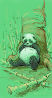
Panda


I finally got a Wacom tablet for my computer and i wanted to do something fun and happy(sorry mike). This is a quick sketch for something I have had in my head, a happy panda tired out after eating his share of bamboo leaves. I would really like tips for using the tablet in photoshop cause im still a rookie at it so have at it. Hi everyone by the way!

8.06.2008

moving right along...


Ok guys, (PLEASE GIVE ADVICE) here is a pencil rough for the next part of my series, this ones called "This Flesh, A Tomb" its about death and the frailty of the human body, so Im thinking i need to represent that more, also I want to do something with the ground plane but im not sure what, i dont want to overcrowd this one like the last one so im starting off slow, I was thinking about putting some ravens on the ground, but let me know what you guys think.

8.04.2008

And here we... GO


Mmk, so I finally figured out how to add stuff on here. Anyways, this is kinda just a quick 2-D study for my next sculpey model. I had some fun playing with brushes and getting the shapes down fast. Just something to get me back into the swing of things before school starts back. I'll start posting the model itself once I've started. In the meantime, lemme know what ya'll think o' this. Suggestions and criticism are mandatory... But you guys knew that already.

8.03.2008

Revamp


OK guys, heres a more complete, slightly revamped version of it. The things you suggested really helped me out, thanks guys. I'm pretty satisfied but i suppose any piece could always use more polishing. PRINTS ARE AVAILABLE, ACT NOW WHILE SUPPLIES LAST! lol

8.02.2008

Venture Value


Here we go guys a finalized line drawing with a few changes and a fairly strong value range. With obviously not as wide a range as will be on the final. Let me know what you guys think of the changes. Other then that keep an eye on my page to see the final. Or come to my apartment where it will definitely be hanging above the couch. haha.