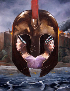
This is my most recent work for a book called Troy. It is about two sisters in the city of Troy before and immediately after the fall. If I had more time I would balance all the colors accurately in the photo, but as it stands this is more or less representational of what the piece looks like without type. Whaddaya think?


3 comments:
Lookin pretty good man. Suggestions, I would like to see the dome top of the helmet arch a bit more. It seems a bit to flat on top. Another thing I would like to see is more Troy burning up in the top left corner. So many other aspects are nearly symmetrical that I keep looking up there thinking there should be more smoke or a bit more flame... something. BUT I think that is subjective I guess. Its looking nice either way. I am a big fan of the texture and brush work you have going on. Kudos.
On second glance, if you arched the helmet top a bit higher, I don't think the left side would really need anything.
Really interesting illustration and comp man. THe metal texture you got going it really nice. For me that helmet really steals the show. If I really had to pick on something the women's face look a bit elongated. Other than that great job on the textures and the water especially.
Post a Comment