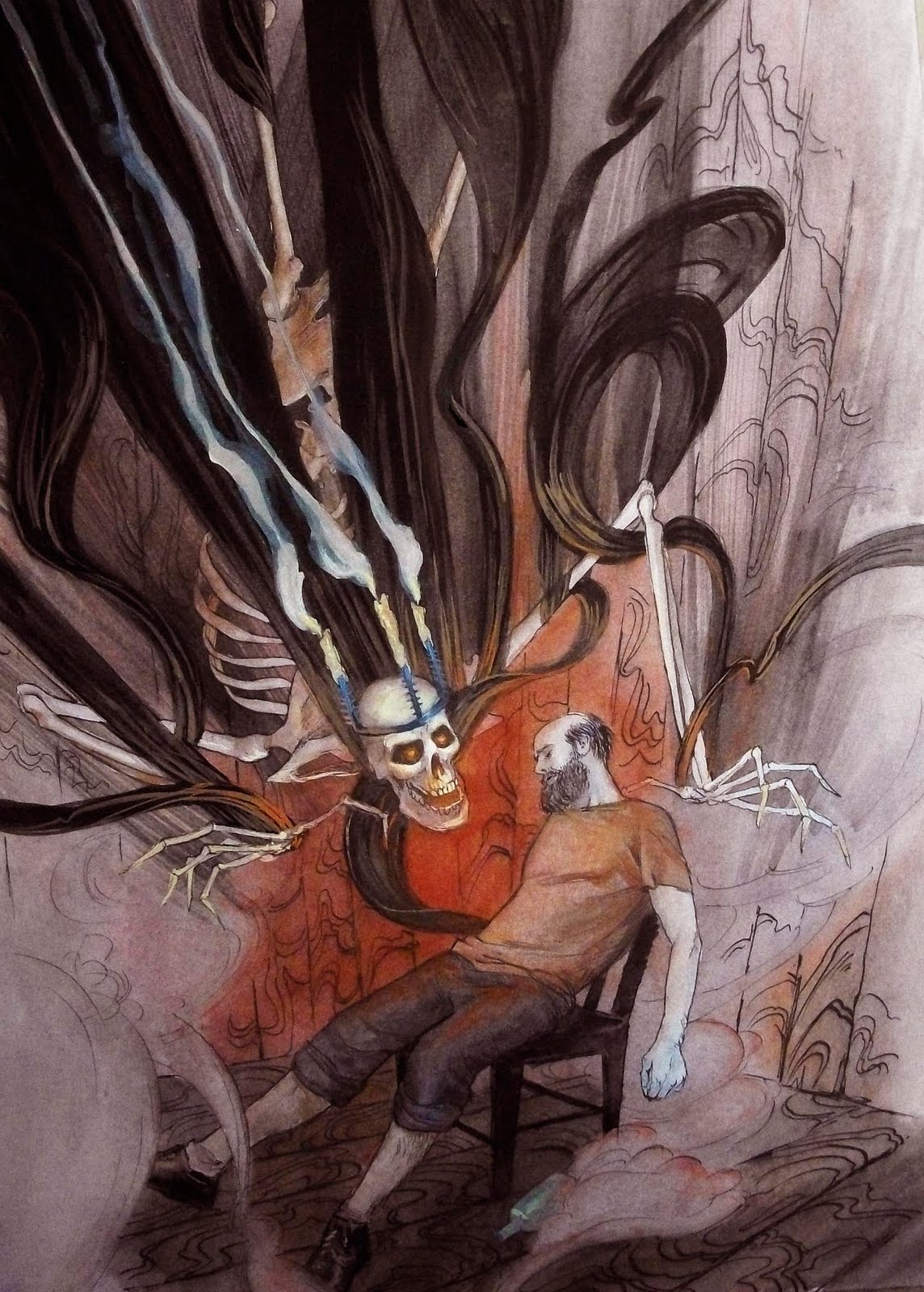
I'd spread the red color all the way around the bearded dude so he gets framed better. The stuff outside of that red area doesn't read as well. You rock my world berneh
I think that Nav needs to have a bit more detail put into him so he is on the same level as the skeley dude. Right now the detail in the skeleton is dominating and I would think that you would want them both to read as important. Also, this seems to have all the detail on top, and that makes the bottom half look unfinished. I second bringing some of the red around would work.
I have no problem with the isolation of the red, it helps define the smoke. I do, however, recommend differentiating the color of his skin. Maybe some reds near the knuckles of the fingers or around the back of the neck. I really love the flow of this piece. keep it up.
I would just suggest adding a bit more depth in the smoke in the surrounding areas and strengthen the shadows/lighting on the figure of the man. Help make him pop and lead your eye from the creature to the figure. Great work by the way. Good post.


6 comments:
I'd spread the red color all the way around the bearded dude so he gets framed better. The stuff outside of that red area doesn't read as well. You rock my world berneh
I don't mean all the way around, just like past his arm...his feet are fine
I think that Nav needs to have a bit more detail put into him so he is on the same level as the skeley dude. Right now the detail in the skeleton is dominating and I would think that you would want them both to read as important.
Also, this seems to have all the detail on top, and that makes the bottom half look unfinished. I second bringing some of the red around would work.
I have no problem with the isolation of the red, it helps define the smoke. I do, however, recommend differentiating the color of his skin. Maybe some reds near the knuckles of the fingers or around the back of the neck. I really love the flow of this piece. keep it up.
is that kortlander :P
I would just suggest adding a bit more depth in the smoke in the surrounding areas and strengthen the shadows/lighting on the figure of the man. Help make him pop and lead your eye from the creature to the figure. Great work by the way. Good post.
Post a Comment