4.29.2009


Here are some of my finals I just finished.  Still way more to go.  I like how they turned out, Arthur Rackham inspired the top two.

Second grade


The assignment was to take a second grader's drawing and render it out in an environment.

4.26.2009

Calling Cloud 9


So I decided to belt this tee design out this weekend. I'm enjoying the look a lot but let me know your suggestions.

Lady Bronze


4.24.2009

Buddy final

4.23.2009

illustrative drawing


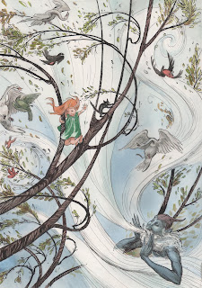
Here are my comps for Tardino's class.  The finish will be pen and ink with watercolor.  The story I wrote is about a little girl that pretends everything in her forest is alive and the owls watch over her while she plays.  I wonder what you guys think about the designs. 

The Void

This is my open assignment for Mahan's class. A kind of retro sci-fi pulp art movie poster. I have been looking up techniques from then and plan to use something close to them for the final. I already have it transfered but nothing really started yet. Keep in mind that this isa rough value study haha, not ment to be a finish. I'll post the rest when I get it done.

4.21.2009

Buddy


I can't really think of how to finish this, suggestions?

Well I decided to go ahead and take this to final for styles and concepts. I'd love to explain what the assignment was but I really don't know anymore.

With the extra time though I'd appreciate any pointers you guys have. I originally wanted to render this but instead chose to stay flat and graphic. I used some halftone in there too so let me know if that's working out alright or not. Thanks :)

4.20.2009

The Somewhere Place


I finally am getting this Children's book thing knocked out. sadly this is as far as i have gotten so far... i have three to go. I should be ok, things should be slowing down now, more or less. Let me know waht you guys think.

4.17.2009

Me Myself and I


well, heres the last episode of the season on these drawings of mine, wanted to go out with a bang and i thought it was time to do a triple self portrait, i had alot of fun doing these and i may be back again some day if it gets the funding for a second season, let me know what you all think

4.14.2009

Are you a Ragged Man?


This is the logo for the food product branding for Styles and concepts. We had to make up a brand, so mine is Ragged Man BBQ Sauce. I still have time to tweak things to let me know what you guys think. I just inked it by hand then added the texture and type with photoshop.

Here are my first two illustrations for childrens market.  The first one is the lobsters building a new cave for their treasure.  The second is the scene after the crabs steal the treasure and the lobsters are freaking out .  The octopus is going to help them think of a plan to get the treasure back.  I've been working on them too long to notice anything that is wrong.  Any
suggestions would be nice.

4.13.2009

A sketch for a personal piece I'm working on...though I'm probably going to use it for watercolor. I'm not sure what will be coming out of the dress, I've been throwing back the idea of a human figure reaching towards her instead. The scanner was too small so i shortened the dress but i'd actually make it spread out further in the final. Any suggestions would be cool.

Personal Branding?


Hey guys. I have decided I need to really pick one of these and stick with it. Personally I love them both and currently have the first on my site and the second on my blog. I thought it would be good to get some feed back on the two. Let me know Which you guys like the most.

Self p


Did some texture work. Improvement?


Started out as an oil painting, brought it into photoshop and added the eyes

4.08.2009

Concept art


Finalized


Update: I decided to really tackle the clothing instead of sort of fudging it. Tried to think of the forms more basically. Something about the head feels off.

Shit, just realized that I left the hands out.

Here's another concept art piece. Crits would be great


detail:

4.07.2009

C+D


Nyaralathotep

this is my comp for the cover of my favorite HP Lovecraft book.  He is a demon that takes the shape of a pharaoh most often.  I am going to make alot of changes but i would be interested in what any of you guys have to say.  

Copyright wierdness update

Looks like Jon was the copycat all along. Bummer for him, ha. In this case, copyright proof from the other almost ten designers he took from called his bluff. Pretty funky stuff!

Okay, let me explain this first. This designer, Jon Engle, is saying that he was stolen from, and the pirates of his artwork sold his stuff to a stock illustration site. Then the site turned around and charged him for using the stock. He refused to pay for his own work, and they started using dirty tactics. The lawyers against him contacted the companies that he worked for and told them that he was in a lawsuit over plagiarized artwork and his clients were then admittedly cold fish on working with him. From his point of veiw, this is a royal screw over. To have to pay for your own work, and then lose clients because of your own integrity? BS.

Now, the site is down because it is really, really hot news right now. But when you read what he has to say, it paints a really bleak picture of the copyright industry. Scary stuff.

Initially I only posted the first link. The link directly to his site. When I started to read into it, however, I found a few sites that may discredit our poor, poor designer Jon. So I posted three of the most important sites relevant to the issue. Whether Jon is innocent or not, and time will tell, this begs the question, could such a situation arise? The answer is yes, and the future is scary. This is a very interesting situation that we as disillistrators might want to pay attention to.

http://www.jonengle.com/2009/04/accused/

http://brettlamb.com/blamblog/

http://www.reddit.com/r/reddit.com/comments/8ac0q/designer_gets_accused_of_stealing_his_own_work/c08p5i7
4.06.2009

Concept art


This is sorta my first try at concept art, Crits would be excellent.

The Mite bot derives solar energy from "fins" on its back. It's about cat sized and is used for long term reconnaissance in environments too toxic, rugged, or generally unfit for human life.

I hope everyone made it to see James Gurney

On the off chance you didn't get to go or you just didn't take notes...Here is a link to the watercolor brush pens he was using during his demo. They aren't to bad price wise either.

Outside of the link overall the whole thing was a pretty sweet presentation, nice guy, very old school but it seemed to be in a way that was more applicable to current illustration. Not to often you meet someone with as much raw talent or knowledge of the history of the field as he has. Put on a great show.

Kuretake Watercolor Brush Pens

4.05.2009


My promotional poster.

Student government elections are being held all next week in the cafeteria, if you find yourself down there go ahead and throw me a vote. :)

4.04.2009

Zoo promotion


I finished up that zoo sketch for humorous, don't know actually if I ever posted it. Regardless, here it is. This piece is entirely different from anything I've done in four years, although I had quite a bit of fun crafting it. Perhaps I should pursue this style further?

Fun Pack


alright then, finally got pieces 4 and 5 in my drawing series scanned and ready for the internet so i wanted to get your opinions. Also a WIP im doing, its sort of a propaganda pin up, I think I would like it to have a little more meaning, not nazism but something else, maybe I should put the CCAD logo in the back instead, that would be pretty funny i think

Well, if we're all being artists...


After seeing the AOI show, I had a bit of an itch to play around digitally. Nothing serious, just a twenty minute doodle, but seeing as how most people on here are a might bit more talented than I am on a tablet, I figured it'd be a good chance to get some feedback. So, here's some sort of a sea-hag, or some otherwise underwater beasty, let me know what you folks think!

4.03.2009

Battle at Saloon No. 9


This is a second painting in my cowboy series, a sort of hard broiled detective story meets the wild west meets illustration. Here our late hero is seen, whilst alive, in the midst of a rather taxing bar brawl. Trying to keep to similar visual clues: singularity of image, the buzzard motif, and of course our main man. He looks alot more like me in this one, since the face is relatively sans distortion this time around. Any crits before i move to paint would be nice, though i'll be honest, these paintings are more the do and done type, so comment quick before i really screw the pooch. haha.


And yeah, this one is as huge as my first.

4.02.2009

King Lear


So here's my playbill for Styles. I had fun with it. Even if for some reason they look like they're wearing cocktail dresses (Mahan). Below is the inkwash I did for the middle sister.

[shy shouldn't touch colour :D]

hmmmm so. the balance of the red. it's a bit overwhelming the main focus, but when i tried to put a little bit of red behind the figures [striped pillows n such] it got really cluttered and hard to read x.x suggestions?


ps-- the drawing isn't done either, there's still a few things to finish like the foot and arm, etc.

4.01.2009

Quickie

A LIttle Somethin From Break

Finally had the time to finish this thing. Got it started right at the end of break. Surprisingly it went pretty quick, so I plan on doing a handful of these things, just similar enough to be a collection. I don't want them to be to similar or ill get bored. haha.