
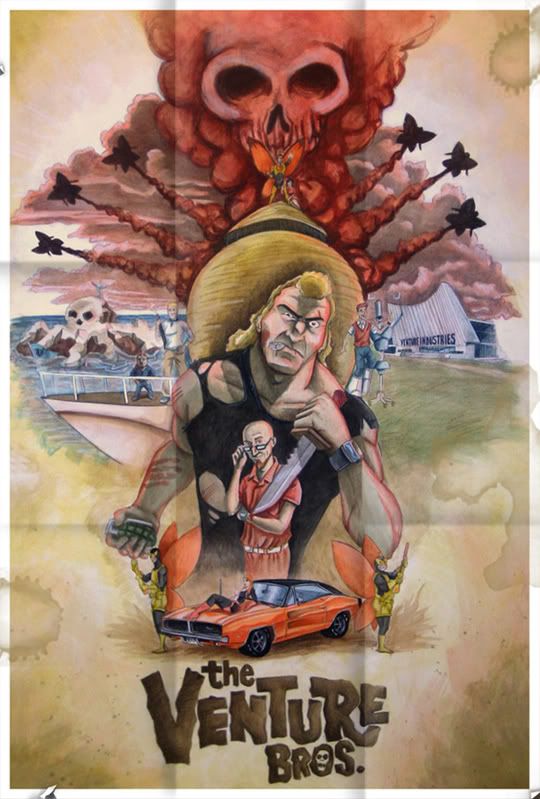
Alright guys here it is. Its all acrylic and a bit of color pencil. all in all it went pretty fast about 4 sessions of 3-4 hours a piece. I really only worked on it after work when i cared enough haha. the Beauty of working on something for yourself. Let me know what you guys think. I have added the worn tattered look and water damage.


9 comments:
Liking the final lines, man. (Except for that tangency between broke and that wing. Gives Brock such womanly hips, and really messes with my eyes.)
I looked at this one for a long time. Just absorbing all the little details. Lot of stuff to put in one composition, and it entirely works out with nothing really getting lost, if only dwarfed by Brock's awesome.
I'm not a hundred percent about the watercolor choice. I don't think that medium has the punch you need to get the brightness of the venture bros. That show has a lot of color and here I wonder if it falls a bit flat. You have all the characters and detail only a true fan would pick up on, but I don't get the vibe of the show from this at all. It could just be a lack of contrast due to the watercolor. I think it would benefit from a small crop on the right side as well, as the negative space is throwing it a bit off balance. I could nitpick all day though, just about anything.
It's really not what I expected with color treatment at all, but maybe that is a good thing, and they have finally gotten a new treatment. There are a few things that really bother me about this, but it's greatly outnumbered by the things I do like about it. The smoke in particular looks awesome.
Thanks mike...I think. I took quite awhile to really tweak the crap out of the composition and never once did I notice that tangent till you pointed it out.
As far as the color goes, that was something that I chose on purpos, it was a pallet that I used as a sort of throw back to the faded action movie posters of the 60's.
Seeing how the whole show revolvs around that 60's vibe/design I thought it would fit it nicly. The big challenge I was trying to adress with it though was a new treatment of the "vibe" with out losing the look and styling of the charatcers. So with that in mind I'm Pretty happy with the outcome.
(aside for that tangent now, haha)
I actually used acrylics, so this was one big layering process. Either way you gotta drop by to see it hung once I'm back in Columbus. Maybe for a movie night!
P.S.: There are two links with my name. fyi.
Love it man, awesome work. I'm with Mike though in that it doesn't give me the show's vibe. I think you could bump up the saturation in photoshop and give it a more graphic look, even though I do see what you were going for. Perhaps you could punch up the colors on certain aspects of it rather than the whole thing... or maybe even a border or something like that. Because while I'll admit you got all the major characters in there spot on, and the composition is very well executed, I still want something to really grab my attention. Oh, and don't obsess over the Hand Tangent. I didn't pick it up until Mike pointed it out.
Haha, Kevin, your are either being a jerk about that tangency or you just gave him another one to worry about.
If you are going for a 60's feel solid blocks of color go a long way, and unordinary shadows. A trick many of them used were to add a translucency by making their darker sections fade to the predominant color instead of just "darker" They normally tend to have a strong contrast brought on by particularly strong shaping. Another huge thing they did was stick to color themes pretty strongly, sectioning off sections of painting. The main thing that hurts this one is that blue for me. Some muted purples wouldn't have hurt your color grouping so much.
The few that didn't do this, like mcguiness still had a very strong graphic quality to the way they painted... sharp calculated shadows that followed contours to an annoying perfection.
OR... You could throw a quick texture of the thing and some mock torn edges like everyone else nowadays, including myself haha.
I didn't mention how good the car came out last time I commented. I wanted to point that out cause I'd say it's right behind hands on the list of things that ruin artists.
dude, thats awesome!
Keep up the good work man.
Am I losing it or did you adjust the colors and repost this?
Nope thats the same post haha, but I will replace the one on my personal blog when i have made some changes.
Yeah I want to get it printed in as a poster and do some textures ad more ventagy things to it to make it look worn, only down side to be affordable i can only go up to 18x24 when the original is 27x40. If anyone knows of a site that prints that large and wont rip me off "printing style" please link me.
As for the color, I originally was going for that kind of shadowing that you just mentioned mike. the sad thing is I couldn't figure out how to do it so I ended up just filling in the shadows more solid.
Over all this was a fun learning experience but I'm glad everyone likes it. Mike thanks for the honest crit too. Though brutal at times, always useful. haha
Man, maybe my eyes were tired but the colors looked way more vibrant than the first time I saw them.
This looks good man. Colors feel a bit better and the edges and tearing justify any non vibrancy that is left.
Only thing I'd do before print is tone down the folds, or use a blending mode like overlay instead of just a dropped opacity which will grey out instead of picking up properties of colors.
I don't know of any online printers sadly. All of these large board game printing memories are coming back to haunt me.
Hey Alex, I know its kinda late to comment, you might not even check this, but i think everything that I could say has already been said. I pretty much agree with everyone, and I know your prolly SICK of hearing it but here it comes one more time. I love the design and the characters are spot on, but the color just isnt coming through as strong, I think grapic would have been much better than the softness you went with.
However, I just want to say Kudos on this, we are all trying our best here and practice is what its all about, KEEP IT UP!
Post a Comment